

Logo Maker : Graphic Designer
Prometheus Interactive LLC
I approached Logo Maker: Graphic Designer as a practical business tool rather than a toy for making attractive pictures. That distinction matters. A logo is often the first visual a small business owner puts on a social profile, invoice, product label, or presentation, so the useful question is not simply whether the app can create something eye-catching. The better question is whether it helps me move from a vague idea to a usable identity without wasting an afternoon.
In my experience, this free business app is most helpful when I already have a rough direction in mind. It gives me a large starting point through templates, icons, and fonts, then lets me shape that starting point into something more personal. Prometheus Interactive LLC developed it, and the app has reached over ten million installs with a 4.6 average from around 139 thousand ratings. That level of adoption makes sense: it lowers the barrier for people who need a logo now but are not ready to hire a designer.
The app is available for everyone and runs on Android devices using version 5.0 or later. The current version is 2.2.7, and the download itself is free, although optional in-app purchases range from $0.99 to $99.99 per item. I would not treat those purchases as an automatic reason to avoid it, but I would keep them in mind before becoming attached to an element that may require payment.
Turning a vague business idea into a workable visual routine
Start with a brief before opening the editor
The easiest way to get a weak result from a logo app is to begin tapping through templates without deciding what the logo needs to communicate. I get better results when I first write down three simple things: the business name, the intended audience, and the feeling I want the mark to create. For a local repair service, that might mean dependable and straightforward. For a handmade gift shop, it could mean warm and personal. This small preparation prevents the template library from making the decision for me.
Logo Maker: Graphic Designer offers more than 5,000 logo design templates, along with icons and fonts. That variety is useful, but it can also create choice overload. I recommend browsing by visual direction rather than trying to inspect everything. Look for a shape that supports the business idea, then judge whether its structure can survive after the text is changed. A template with a beautiful preview but an awkward name length is less useful than a simpler design with room for the actual brand name.
Related News

Why WhatsApp Messenger Still Makes Everyday Communication Feel Easy

Jurassic World: The Game Is the Better Dino Tycoon for Strategic Players

Threads in Real Life: Who Should Join, Lurk, or Leave

How SHEIN Turned Shopping Into an Endless Content Feed

How to Make Fortnite Feel Smarter on Mobile

Should You Switch to Microsoft Outlook on Mobile?
I also try to separate inspiration from selection. During the first pass, I save or remember a few directions instead of editing the first design that catches my eye. This makes comparison easier. One template may have the right symbol but a poor text arrangement, while another may provide a better foundation for a long business name. Thinking this way turns the app into part of a repeatable design process rather than a slot machine for random graphics.
Capture ideas without losing the thread
Once I have a direction, I focus on the parts that matter most: the symbol, the lettering, the spacing, and the way the design feels at a small size. The icon should support the name rather than compete with it. If the symbol is very detailed, I prefer calmer typography. If the business name is short, the icon can carry more of the personality. These are simple decisions, but they keep the final logo from looking like unrelated pieces placed together.
The font selection deserves more attention than many first-time users give it. A decorative font can make a concept feel friendly, but it may become difficult to read on a small profile image. A heavy font can feel confident, yet it may overwhelm a delicate symbol. I usually test the name in several contrasting styles and then remove the options that look impressive only at full-screen size. A logo should still make sense when viewed quickly on a phone.
Gallery
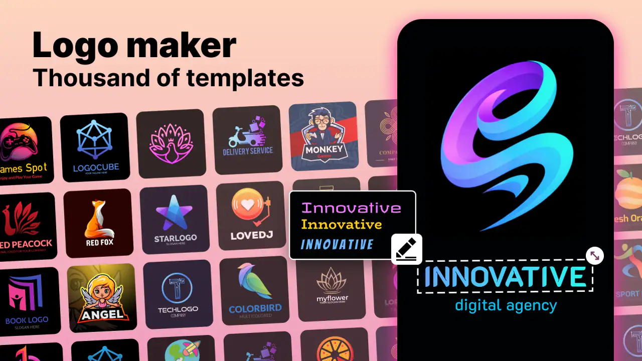
The same applies to icons. I would avoid choosing an icon simply because it literally depicts the product. Literal symbols are easy to understand, but they can also make a business look interchangeable with every competitor in the same field. A more restrained shape, an abstract mark, or a carefully chosen letter-based idea may give the result more personality. The app provides the raw material; the quality still depends on editing choices.
Build a small set of useful versions
One of the most practical ways to use this app is to create a small family of logo variations instead of treating one design as the only answer. I might keep a main version with the full name, a simpler version for a compact social avatar, and a text-light option for situations where the symbol needs to stand alone. This does not require inventing a completely different identity. It means adapting the same visual idea to different spaces.
That workflow is especially useful for someone running a small business alone. Imagine a person launching a weekend baking service. They may need a profile image, a menu header, a sticker, and a simple mark for messages to customers. Making one elaborate logo and forcing it into every location can produce cramped text and unreadable details. Creating related versions in the app gives that person more control without requiring a separate design program for every minor adjustment.
I would keep the original concept unchanged while experimenting with variations. Make one copy for a different font, another for a simplified icon, and another for a more compact arrangement. This makes it easier to compare decisions and return to the strongest version. It also protects the initial idea from being gradually altered until nobody can remember what made it appealing in the first place.
Use the app as a repeatable routine, not a one-time event
A sustainable logo workflow has several short stages. I begin with the brief, explore a limited group of templates, edit the strongest candidates, inspect them at small size, and then leave them alone for a while before making the final choice. That pause is valuable because a design that feels exciting after twenty minutes of editing may look cluttered when I see it again later.
After choosing a leading version, I compare it against the business name written plainly. Can I read it immediately? Does the icon still make sense without a long explanation? Would I recognize it if the colors or background changed? These checks are more useful than asking whether the design looks “professional,” because that word can mean almost anything. A logo should first be clear, appropriate, and easy to reuse.
I also recommend keeping notes outside the app about the choices that define the identity. Record the preferred font style in ordinary language, the icon concept, and the version that should be used most often. The goal is not to create a formal brand manual. It is simply to avoid making a new decision every time the logo is needed. This is where the app fits into a broader productivity system: it helps create the asset, while a small external note helps maintain consistency.
For a freelancer, this routine can be repeated whenever a new service is added. For a community project, it can help the team agree on a direction before publishing anything. For a student selling handmade products, it provides a way to test several identities before committing to packaging. In each case, the value comes from reducing friction between an idea and a usable visual, not from endlessly decorating the design.
Where the workflow can fail
The biggest risk is mistaking a template for a finished identity. A template is a starting structure, not proof that the result suits the business. If I change only the name and leave every other choice untouched, the final logo may still feel generic. Even a modest adjustment to the icon, font pairing, or balance can make the design feel more intentional.
Another failure point is trying to communicate too much. New businesses often want the logo to show the product, location, personality, service promise, and target audience all at once. That usually creates a busy mark. I prefer choosing one central idea and allowing the rest of the business to be explained through the profile description, website, packaging, or other content. The logo does not need to tell the entire story by itself.
Choice overload is also real. With thousands of templates available, browsing can easily become procrastination disguised as research. I would set a personal limit before starting, such as selecting a handful of serious candidates and editing only those. The point is not to find the perfect template hidden somewhere in the library. It is to find a flexible foundation that can be made appropriate for the particular business.
There can also be friction around optional paid elements. Since the app is free to use but includes purchases from $0.99 to $99.99 per item, I would avoid building the entire concept around a design component before checking whether it is available without an extra charge. A practical approach is to develop a strong alternative using the accessible choices first. That way, a paid asset becomes an optional improvement rather than a surprise that blocks the project.
Small-screen editing has its own limitations. Fine spacing decisions are harder when I am working on a phone, and a logo can appear balanced in the editor while feeling cramped in a real profile circle. I therefore inspect the design at the size where it will actually be used. If the name becomes unreadable or the icon loses its shape, I simplify instead of adding more adjustments.
How it compares with the usual alternatives
Compared with drawing a logo from a blank canvas, this app is much faster for someone who does not already think like a designer. The templates provide structure, and the combination of icons and fonts makes it possible to explore a coherent direction without starting from geometric shapes or complex layers. That is the main reason I would recommend it to a first-time business owner.
Compared with hiring a professional designer, the trade-off is obvious. The app is more affordable and immediate, but it cannot replace strategic discussion, custom illustration, or a carefully prepared brand system. A designer can ask difficult questions about positioning and create an identity that is genuinely distinctive across many formats. If the logo will represent a serious long-term company, appear on products at scale, or need precise professional files, I would consider the app a temporary solution or a way to prepare ideas for a designer.
Compared with general-purpose design editors, Logo Maker: Graphic Designer feels more focused. A broad editor may offer greater freedom, but that freedom also means more decisions about canvas size, layout, and construction. This app is better when the immediate task is specifically a logo and I want guided starting points. A general editor becomes the better choice when I need to design a complete flyer, presentation, social campaign, or other material around the logo.
That focus is both its strength and its boundary. I would not install it expecting a full business design suite. I would install it because I need a practical logo-making workflow that gets me moving quickly and gives me enough control to avoid using a completely untouched template.
Who should adopt it, and who should skip it
I think this app is a strong fit for solo entrepreneurs, small online shops, freelancers, student projects, clubs, and local services that need a presentable identity without a complicated setup. It is particularly useful when the person responsible for the business is also responsible for every creative task. The guided starting points reduce the intimidating blank page, while the available fonts and icons leave room for personal decisions.
It is also a good choice for someone who needs to explore several directions before spending money. A person opening a tutoring service, for example, can test whether a friendly symbol, a clean wordmark, or a more formal arrangement better matches the intended audience. That exploration can clarify the brief even if the final identity is later created by a professional.
I would skip it if I already need advanced vector control, a highly original illustrated mark, or a complete identity system with carefully specified usage rules. I would also look elsewhere if the main task is designing marketing materials rather than a logo. The app can help with the starting asset, but it is not the right central tool for every visual communication job.
Users who dislike browsing or making visual decisions may also find it less satisfying than expected. The templates make the first step easier, but they do not remove the need to judge typography, balance, and clarity. If I simply accept the first attractive result, I may end up with something polished-looking but forgettable. The app rewards a little patience and a willingness to reject designs that do not fit.
My practical verdict after using its approach
I see Logo Maker: Graphic Designer as a useful first-stage branding tool. Its greatest advantage is not merely the size of its template collection; it is the way those starting points help a non-designer turn an undefined idea into several concrete options. The best results come when I use the app deliberately: prepare a brief, narrow the choices, test readability, create a few related versions, and keep a simple record of the final decision.
The free entry point makes it easy to try, and the everyone rating makes it suitable for a broad audience. I would still watch for paid items and remember that a template-based result has limits when originality and long-term brand strategy matter. Those are not small details, but they are manageable if I treat the app as one step in a larger workflow rather than as a replacement for every design need.
For a friend launching a small project tomorrow, I would recommend giving it a try. I would tell them not to chase the most elaborate option, not to judge the logo only at full size, and not to confuse more decoration with more personality. Used with those boundaries, it can produce a clean, usable starting identity and save a great deal of time. For a company ready for a distinctive, carefully engineered brand, I would recommend moving to a professional design process instead. That balance is where this app makes the most sense.
FAQs for Logo Maker : Graphic Designer
What is Logo Maker: Graphic Designer used for?
Logo Maker: Graphic Designer is a mobile design tool for creating logos, brand marks, icons, and other simple promotional graphics. It typically combines editable templates, text tools, shapes, symbols, colors, and background options, allowing beginners to produce a logo without advanced design experience. It can be useful for small businesses, online stores, social media profiles, clubs, and personal projects.
Is Logo Maker: Graphic Designer suitable for beginners?
Yes, the app is mainly aimed at users who want to design quickly rather than build artwork from scratch. Its template-based workflow makes it possible to choose a starting design, replace text, adjust colors, and add or remove graphic elements with relatively little effort. However, users seeking highly original branding may need patience, because creating a distinctive result often requires more editing than simply applying a ready-made template.
Does Logo Maker: Graphic Designer offer free templates and design tools?
The app generally provides a selection of free templates, fonts, shapes, and editing features, but the exact catalog can vary by version and platform. Some premium designs, assets, export options, or advanced tools may require an in-app purchase or subscription. Before starting a project, it is worth checking which elements are marked as paid so you can avoid spending time on a design you cannot export freely.
Can I save and export logos created in the app?
Logo Maker: Graphic Designer is designed to let users save their projects and export finished designs for use on websites, social networks, business profiles, or printed materials. Available formats, image resolution, and background options may depend on the selected tool or subscription plan. Check the export screen carefully, especially if you need a transparent background, high resolution, or a file suitable for professional printing.
Is a logo made with Logo Maker: Graphic Designer legally unique and ready for trademark registration?
Not automatically. A logo created from shared templates, stock icons, or commonly available design elements may resemble work made by other users, and some assets can have usage restrictions. The app helps you produce visual branding, but it does not guarantee exclusivity, copyright ownership, or trademark eligibility. For commercial use, review the asset license and consider creating a more original design before registering or heavily promoting the logo.
Pros
- Large template library helps beginners create logos quickly.
- Supports custom colors
- fonts
- icons
- and layout adjustments.
- Useful for social media branding and small business projects.
- Simple interface makes basic editing easy to learn.
- Exports designs in common image formats for convenient sharing.
Cons
- Many premium templates and assets require a subscription or purchase.
- Some designs can feel generic without extensive customization.
- Advanced vector editing tools are limited compared with desktop software.
- Free exports may include restrictions depending on the selected design.
- The app may show frequent ads while browsing templates and editing.


